Article Snippets & Layout Options
Slayte CMS gives you total control over how articles are displayed across your site. Choose from a variety of layout snippets to present articles in ways that match your brand and page structure — no plugins or page builders needed.
🟩 Grid Layout (3-Wide)
This layout evenly divides your article feed into a 3-column grid with equal-height cards and preview images.
🧱 Masonry Layout
Masonry adjusts card height dynamically for articles with different amounts of content or image ratios. Ideal for dynamic blogs or creative layouts.
🟦 2-Wide Layout
Simple and readable. Use this for wider blocks with room for text, summaries, or extended metadata.
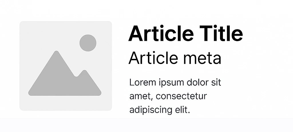
🖼 Image Left (1:1 Aspect)
A clean layout that places the article image in a perfect square to the left, with title and meta stacked on the right. Great for lists or index pages.
🔀 Mixed or Responsive Layouts
Slayte CMS supports hybrid layouts where columns collapse responsively or combine grid + stacked blocks. Each snippet is controlled by a PHP include, making it easy to switch between styles per page or section.